8.10.10

Brands recharged


I always looked at brands redesign as internal-external rejuvenation exercise where brands publicizes refreshed expressive attributes while maintaining core beliefs and values.

Brand are reflection to contemporary society wants, needs and hopes, they speak same language and dress same as well otherwise will disconnect and becomes absolute.

Brand viewpoint continues transmitting assures connection and interactivity , whatever tone of voice and graphic language for packaging, merchandise, clothing, and mobile apps or any expressions of the brand for off air, online use must clearly communicates what is the brand all about today and what aspire to be in the future.

Gap-logo

29.9.10

Mission Possible: LOGO/ Identity relevance

Nordkyn Logo, New
Two municipalities — Gamvik and Lebesby — have come together to promote tourism to the peninsula and worked with Oslo-based Neue Design Studio to create an identity that, literally, reflects the nature of this destination: Visit Nordkyn.

The visual identity is based on two main ingredients; our newly developed payoff, "Where nature rules," and weather statistics from the Norwegian Meteorological Institute. A feed of weather statistics affects the logo to change when the direction of the wind or the temperature changes. On the website, the logo updates every five minutes. We developed a logo generator where Visit Nordkyn can download their logo to the exact weather conditions of that particular moment. Nordkyn is truly a place where nature rules, even over the visual identity.
Nordkyn
Structure of the changing icon.

Nordkyn

Colors cover a range of temperature from -25°C (-13°F) to 25°C (77°F).

Animation showing the logo changing direction and colors.
Nordkyn
Sample iterations of the logo. Click image for bigger view.
Nordkyn
The icon itself is deceivingly simple, with a single point that stretches in the direction the wind blows, giving it the appearance of extensive flexibility that, when paired with the muted rainbow of colors, makes it feel infinitely mutable. The typography goes almost unnoticed but provides just enough personality to make the logo feel scientific and official.


Nordkyn
Stationery.
Nordkyn
Nordkyn
Business card.
Nordkyn
Nordkyn
Nordkyn


19.9.10

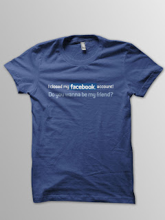
Grey Stockholm moves their entire site to Facebook

I hate to make it sound predestined but I can say that I saw it coming! Brands are moving to Facebook (social media platform) and ditching known / familiar WWW .

I always thought a startup / small/ home business can do it but a BANK and a key advertising agency ..that’s a first and I hope many to come.
I think an agency can claim that they are innovative but Grey saw it as inevitable and moved to Facebook following simple philosophy /strategy “We want to be where people already are, and 2.5 million Swedes are on Facebook, so that's why we have moved our site to Facebook”

15.9.10

Beitech: Anorexic Funeral


“15% of woman who suffer from anorexia will die this year. 
For donations: www.beitech-ed.org


Beitech is a non profit organization for woman with eating disorders.

Advertising Agency: Mccann Erickson, Tel-Aviv, Israel
Vice President Creative Directors: Eldad Wienberger, Tal Raviv
Creative Director: Igal Hazan
Art Director: Ifat Shleziger
Copywriter: Asaf Zelicovitch
VP Accounts: Ifat Wieder-Arad
Account Director: Chen Biran

7 Skills for a Post-Pandemic Marketer

The impact of Covid-19 has had a significant impact across the board with the marketing and advertising industry in 2020, but there is hope...