Showing posts with label CocaCola. Show all posts

29.8.14

Coca Cola | Happy ID

Insight

Over the years, Coca-Cola has built the credentials to lead and talk about happiness through numerous campaigns, both international and local through multi-target communication. However, one of its more challenging targets was teens; its brand´s engagement indicators were below its expectations and it needed to impact especially in this target. 

Strategy

Coca-Cola realised that it needed to focus its communication in connecting with teens through the pillar of the brand’s strategy: happiness. It needed to inspire them with a strong message of happiness that would link them emotionally with the brand. 

Execution

Coca-Cola detected that despite Peru’s economic growth and pride, Peruvians were not happy, and this was shown in in the most basic form of expression: they were not smiling in their IDs, even when there’s no law that forbids them to.

It found an opportunity to spread happiness all across the country with a simple but significant action to make a difference: encourage Peruvians to smile in their IDs. 
Coca-Cola developed a complete IMC support plan for this Campaign, mainly in: 
1 Online :
- Digital viralization of the campaign video, explaining the concept of the Happy ID had paid support on Youtube true view format. 
- Banners and advertorials in important newspapers websites for the launch of the campaign. 
2 Out-of-home:
- Special out-of-home billboards and other elements inviting Peruvians to be part of this movement. 
3 TV spots and PNTs In TV Programs sponsored by CC. 
4 Radio:
Spots and special mentions for the first phase of the campaign. 
5 Below the Line:
Photo booths installed in shopping Malls all over Perú. Free Coke and ID photo only if you smile 
6 Press:
Special Ads explaining the concept of the campaign 

Results

The campaign was a viral success, with more than 1.3 million shares on social networks and free press of USD 300M. The Happy ID movement had a 58% of awareness and 75% associated it with Coca-Cola. 
The positive response and action was immediate: 90% of new IDs in the first month of the campaign were happy IDs. 
It helped increase main brand indicators: Coca-Cola’s brand Association with Happiness increased 8pp, the for someone like me indicator increased +10pp and Brand’s differentiation increased +12pp in the period of the Campaign. 
This is just the beginning: 62% of Peruvians intend to get a Happy ID. 

BRAND:
Coca Cola
CATEGORY:
Drinks (non-alcoholic)
REGION:
Peru
DATE:
May 2014 - ongoing
AGENCIES:
McCann Lima
Havas Lima
MEDIA CHANNEL:
Online,Out-of-Home,Print,TV

    12.8.11

    Coca-Cola Egypt – Say Like


    Coca Cola Egypt has launched an online campaign called ‘Say like’. The new initiative includes a video on YouTube – with various people explaining the benefits of liking something – and a Facebook app called the Like ‘O’ Meter.
    Project Say Like
    Client Coca-Cola Egypt
    Creative agency Elephant Cairo
    Copywriters Maged Nassar, Ali Ali
    Directors Ali Ali, Maged Nassar
    Producer Hossam Fawzy
    Exposure YouTube, Facebook

    7.8.09

    Coca-Cola vs. Pepsi

    Coca-Cola Logo

    In the last couple of weeks, a JPG has been making the internet rounds and, in the process, has gathered more than 6,500 Diggs (not that that is any measure of successful success, but still…) and has been mentioned in dozens of design and culture blogs, including many which I frequent and respect. The problem is that the JPG is wrong and disingenuous. It comparatively illustrates the evolution of the Pepsi and Coca-Cola logos from their beginnings in the late nineteenth century to their current state at the end of the 2000s. The comparison chart mocks the ever-changing personality of the Pepsi logo in contrast to Coca-Cola’s stoic script logo, unaffected by the effects of time. The philosophical point it makes is indeed funny and, for the most part, accurate: Coca-Cola has long been the steady brand that triumphs over Pepsi as the latter attempts to gain ground with brand gimmicks and changes. And I will be the first to admit that the Coca-Cola logo and its consistency over the years is far more supreme than Pepsi, but every time I saw this JPG come up in more and more web sites and blogs I couldn’t help but cringe at the inaccuracy and deception it engenders.

    Coca-Cola vs. Pepsi Chart Fail

    Pepsi vs. Coca-Cola Logo Evolution chart with a fat X from Brand New.

    True, no one will die and the lasting effects of this JPG mean nothing, really. But I felt a burden of duty to correct a few things. The biggest problem is that the chart puts the same logo in 1885 as it does in 2008. This is not only wrong but idiotic. Technically, the Coca-Cola logo as it exists today can not be replicated with the tools of 1887 which, by the way, is the year the script logo was introduced. Not 1885. Coca-Cola was first served in 1886 and even then, the first official logo of Coca-Cola was not the script logo. It first appeared in the Atlanta Journal Constitution in 1886 as both a slab serif and chunky sans serif — it wasn’t until mid-1887 that Frank Robinson, Coca-Cola’s bookkeeper, drew the first traces of the Spencerian script logo that we all know.

    Coca-Cola First Logo

    First Coca-Cola logo appeared in the Atlanta Journal Constitution on Saturday May 23 1886.

    The chart, for comic and poignant effect, then leaves a 120-year gap between the first and last logos. It makes for a great viral JPG, but not for telling the real story. For the first ten to twenty years you could probably find a dozen different executions of the Coca-Cola script as the logo was probably drawn over and over for different applications. It isn’t until the 1930s and 1940s that a clear interpretation of the logo appears and is used consistently. During the late 1950s and early 1960s the script logo is placed within a shape, referred to as the “fishtail” logo, which is as off-brand as anything that Coca-Cola has ever done.

    The chart also fails to mention the introduction of the wave, a ubiquitous visual today, that was first implemented in the 1960s when Lippincott Mercer was in charge of making the Coca-Cola identity more consistent. More than any Pepsi blunder, the chart ignores the introduction of “New Coke” in 1985 with a new formula marketing and set of logos — that completely ignored the script logo — that left a bad taste in their consumers’ mouths. Around the same time, in 1986, Landor began rolling out an even more developed brand identity that modified the wave among other subtle changes.

    Missing from the chart in the Coca-Cola evolution is the penchant for Coca-Cola to use the shape of its bottle as an icon, acting on and off as the logo or complementary logo or subsidized logo of the main script logo, sometimes to a confusing fault. Today’s Coca-Cola logo is, of course, amazingly similar to what it was 124 years ago but it’s not quite fair to idolize them for a flawless consistency that they haven’t actually earned.

    Once more, I will say that the Coca-Cola evolution is admirable and few companies — probably just GE — can claim to have extended their identity heritage across three centuries, but Coca-Cola isn’t perfect and as much as I despise the new Pepsi identity — which in no way am I trying to defend — I believe a fair comparison is in order.

    So, here is the new chart. It’s not ideal, since I didn’t have a document as clean and specific as this onefor Pepsi (scroll to last page of PDF) and I had to cobble the logos from different sources. The reds are all over the place and some are in black and white.

    Coca-Cola First Logo

    Excerpt Empty===============
    Coca Cola Script Trademark/Logo


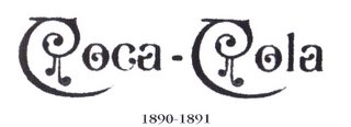
    Early script variation with diamonds.

    Unusual typestyle used on a number of calenders.

    Early script with the line extending from first "O" "Trademark" in tail; also no trademark in tail.

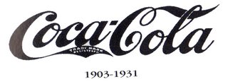
    Crude script with "Trade-mark" in tail, under the tail or no trademark with "Trade Mark Registered" in tail 1901-1903

    Custom script with "Trade-Mark" in tail; note open "O's", and unusual tails on "C's"

    Misused script "Trade-Mark Registered" in tail; used on some 1903 calenders.

    Traditional script "Trade-Mark Registered" in tail.

    Traditional script "Trade-mark Reg. U.S Pat. Off." in tail

    Traditional script "Reg. U.S. Pat. Off." under script.

    Traditional script "Trade Mark (R)" under script.

    "Arciform" logo also called "Fishtail" logo by collectors.

    "Dynamic Ribbon" also called "Wave" logo; actually introduced in late 1969

    7 Skills for a Post-Pandemic Marketer

    The impact of Covid-19 has had a significant impact across the board with the marketing and advertising industry in 2020, but there is hope...