16.4.12

Maoam mixer


This is an excellent example of a seamless online-offline integration achieved with an accessible game mechanic.

Maoam uncovered a sticky situation surrounding the name of its chewy sweets. Children weren't choosing or asking for the brand as they were unsure how it should be pronounced. The Maoam brand has been around since the early 1930s, so rather than change the name, Maoam opted for a campaign that would allow children to recognise the word 'Maoam' and let them play with its unusual sound.

Kids could play the Maoam Mixer online via Facebook, or download it from the iTunes store for the iPad. The Maoam Mixer also took to the road on a tour of shopping centres around the country, bringing the app to life in a live competition environment.
The bright colours and cartoon graphics that appear on packets of Maoam sweets disguise the fact that children have been enjoying the fruit flavour chews since the 1930s. Although acquired by Haribo in the mid-1980s, the Maoam brand name was retained and is still a popular confectionary across Europe, especially in its native Germany.
Haribo become a popular and easily recognisable brand and in the UK is almost synonymous for any kind of gummy sweet, but Maoam has struggled to achieve the same connection with consumers.
What's in a name?
Insight revealed that children were choosing other sweet brands over Maoam as they were unsure of how to pronounce the name when asking for it. Rather than go through the time and expense of changing the brand name, Maoam decided to launch a campaign that would educate children how to pronounce the name, let them have fun with the word and raise the brand's social media profile.
Maoam: The game
Maoam Mixer, a game that helped children play with the brand name was designed and became the central pillar of a campaign that would combine online and real world activity. The game allowed children to create a track featuring different expressions of the word 'Maoam'. These could be enhanced with animal noises, percussion, musical stings and other sound effects. The app, hosted on Facebook, allowed users to create their own Maoam avatar, play the mixer and post their finished track on their Facebook profile.
Each week, ten mixes from the Facebook app were selected to win prizes. One winner took home an iPad2, with goody bags for the other nine.
A downloadable version of the app was made available through Apple's iTunes store.
Maoam roadshow
Two experiential hit squads travelled the country over a period of 10 weeks in branded 4x4 vehicles delivering samples in city centres, local attractions etc.  They delivered Maoam Giant Strawberry stripes along with relevant messaging, literature etc pointing the consumer to the Maoam Mixer app on Facebook.
This street-sampling ran in conjunction with the Maoam Mixer Experience Tour - a 6x6m stand that resembled a giant stereo that visited major shopping centres across the country.  This offered an extended brand experience and allowed consumers to try out the Maoam Mixer app on iPad stations via their Facebook pages, or they could try their skills on the competition stage where two wannabe DJs went head-to-head on Maoam Mixer touch-screens to create the most popular mix track. The stand was designed to be very bright, colourful and an engaging space for children. Experienced staff and an MC were on hand to make guide the brand experience.

Results

The Maoam sampling campaign was extended due to its early success. The sampling target was increased from 800,00 to 1,052,000 packs.
As of September 2011, the Maoam UK Facebook page has 432,594 fans, which represents an approximate 20% growth over the past six months.
The app was made available on the iTunes store 14/9/11.
Facebook records the Maoam Mixer as having nearly 12,000 monthly active users.
Social baker figures indicate that the Maoam Facebook page acquired more than 5,500 fans in the first two weeks of September 2011.
Links

BRAND:
Maoam
BRAND OWNER:
Haribo GmbH & Co. KG
CATEGORIES:
Confectionery/Snacks
Food
REGION:
United Kingdom
DATE:
July 2011 - ongoing
AGENCIES:
i2i Marketing
Crab Creative


A masterpiece in wine


Wine labels are similar to luxury brands in that as a group, they have been collectively resistant to marketing innovation, believing that the quality of the product is good enough marketing in itself. This interactive billboard and the wider art project it comes from is a beautiful idea supported by a clever use of SMS technology.

They don't drink a lot wine in Latin America. Drinkers in France and Italy happily quaff between 50-60 litres of the stuff annually per capita, which makes the Colombian average of 0.26 litres seem a particularly restrained amount.

But the local market for wine has been steadily increasing over the past decade, and Argentinean label Bodega Navarro Correas has been capitalising on this trend and celebrating the work of local artists with its 'Arte por dentro y por fuera' campaign. Translated as 'art inside and outside', this campaign is based on the idea that if Bodega Navarro Correas produces a masterpiece inside the bottle, its consumers can produce masterpieces on the outside.

This amazing billboard in Colombia is the latest expression of 'Arte por dentro y por fuera', and proves that you can create an arresting work of art with wine, robotics and a little bit of SMS technology.


BRAND: Bodega Navarro Correas
BRAND OWNER: Diageo
CATEGORY: Drinks (alcoholic)
REGION: Colombia
DATE: August - August 2011
AGENCIES: Alpha 245, Leo Burnett

4D in-store projection

Projection events have become increasingly popular as one-off stunts. This is the first example we've seen where the technology has been employed on such a scale, indoors and for a prolonged period, as part of a campaign

Ralph Lauren has been wearing its digital heart on its sleeve of late. Much of this is down to David Lauren (son of Ralph), who as SVP of advertising, marketing and corporate communications is widely recognised as the man who has helped bring the Ralph Lauren brand into the digital age.


Luxury brands were initially a bit slow to embrace digital. Decades of high quality glossy print and expensive live shows were ingrained on the luxury and fashion marketing consciousness. 


There was a superior attitude that the quality and equity of a brand spoke for itself, and luxury brands largely ignored the opportunities of digital, save for a few expensive looking flash based websites.
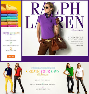
Fortunately this has begun to change, and when Drive Production’s giant horses came crashing through the walls of a German department store to help promote the new ‘Design Your Own’ collection from Ralph Lauren, the fashion brand’s mastery of digital became apparent.

When Ralph Lauren celebrated its '10 Years of Digital' anniversary with an extravagant 4D projection in New York and London in December, it was more a media event than a campaign. But when Ralph Lauren launched its 'Design Your Own' collection at Berlin's prestigious KaDeWe department store, the 8-minute film was re-configured for the indoor location.

'Design Your Own' is a new customisable range of polo shirts. Customers select their colour of shirt, and can then choose their favourite Ralph Lauren monogram, in whatever colour they choose - creating the perfect polo just for them.
The atrium of one of Europe's largest luxury department stores, the KaDeWe in Berlin, has been taken over for the entire month of August, with a bespoke 4D digital arts installation from Drive Productions running six times a day. This is the first time 4D mapping has been used inside a fashion store anywhere in the world.
Powerful architectural projection mapping technology takes the audience on a visual journey, creating the illusion that images of models, products and on occasion polo ponies are literally appearing beyond the walls and floating out into space and towards the audience. The experience featured a new ending, to incorporate the 'Design Your Own' collection,.
At each screening, the atrium at KaDeWe - a large, brightly lit space is turned into a cinematic presentation area in a matter of minutes with the use of a combination of motorised blinds, projection screens and heavy black velvet drapes. The projection area is equivalent in size to six double decker buses.
Drive's motion graphics team created the impression of a building projection on the clean, white interior architecture at KaDeWe by projecting 3D architectural geometry, onto and into which the content of the show had been mapped.

Ben Fender, company director of Drive Productions, commented: "Architectural 4d video mapping is that rare thing - a technique that still has the wow factor - both in terms of the creative and technological possibilities it gives brands and in terms of consumer reactions to it.

But the key factor to the success of this medium is the transformational content where It is now possible to create art installations that act as stand-alone pieces of global advertising- bringing together art technology and in this case 'design your own' fashion into one perfect package."


Ralph Lauren 4D Projection Mapping Show, Berlin


The Official Ralph Lauren 4D Experience - New York


The Official Ralph Lauren 4D Experience - London


BRAND:Ralph Lauren
BRAND OWNER: Ralph Lauren
REGION: Germany
DATE: August - August 2011
AGENCY:Drive

Jack & Jones Fitness Club

Using sex to sell isn't innovative, but the clever addition of a VIP club to persuade even casual viewers to submit personal information takes advantage of the viral potential of the site.

A campaign that uses overtly sexual imagery to drive consumer engagement. It isn't big, and it isn't clever, but this online fitness studio that promotes the spring/summer collection from men's fashion brand Jack & Jones provides hours of entertainment.
Jack & Jones is a brand for the fashion-conscious man about town. Positioned toward the premium end of the crowded high street category, it's important for a brand like J&J to keep men interested. Unsurprising then, that J&J decided the best course of action was to treat the boys to a pretty lady who would cavort about on their computer screens.
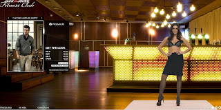
Visitors to the Jack & Jones Fitness studio first of all choose their look from the collections on offer. Based on the premise of teach the user some exercises that will help get them in the best shape to show off their new outfit, a helpful gym instructor shows the lucky online shopper some helpful moves. In her pants.
The premise is simple, slightly ridiculous but excellently realised digitally.
Visitors who want to see more can visit the VIP club, with the promise of more gym class demonstrations. A pass to the VIP club can be obtained by purchasing product or submitting some personal details to a mailing list.
Once in the VIP section, the Jack & Jones instructor offers classes in skipping, pole dancing and trampolining.  As an extra treat, the viewer can switch on options, such as slow-motion or water, to add to the experience.
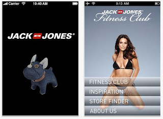
An associated Jack & Jones Fitness Studio iPhone app replicates the experience for mobile, helping users to "get in shape and ready for action".


BRAND:Jack & Jones
BRAND OWNER:Bestseller A/S
CATEGORY:Accessories/Clothing/Footwear
REGION:DenmarkFinlandGermanyThe NetherlandsNorwaySwedenUnited Kingdom
DATE:June 2011 - ongoing

27.3.12

Hitler says!!!


Turkish cosmetics company Biomen has gone public with a new commercial for mens' shampoo, starring none other than Adolf Hitler.


"Beneath the images of the Nazi leader the firm typed the message 'If you are not wearing a woman’s dress, you should not use her shampoo either.'


The piece then concludes: 'Here it is, a real men’s shampoo, Biomen.'"

26.3.12

Secret Of Logos !


Lovestore: Bullet, Grenade, Gun


“Make love, not war.”
Advertising Agency: Looma, Kishinev, Moldova
Creative Director / Art Director: Sergey Prokopchuk
Account Manager: Samohvalova Xenia


HOWEVER... its another copycat.... shame!


MTV To promote the use of condom “Aids kills” – 2006
Agency : Ogilvy Lisbon (Portugal)

Instagram for brand communications

Webstagram is an Instagram Web Viewer.While Launched in Apple’s App Store in October 2010, Instagram is a photo sharing application famous for its easy to apply filters that magically improve the pictures we share with friends and followers.
Everybody-iphone users- is an instantaneous creative 
slide your iphone on, take a photo and use Instagram to turn your average snapshots into artistic image to share.

Brands using Instagram well — like StarbucksBurberryGE — are those who have also invested in a range of social platforms such as Tumblr and Pinterest. They understand these tools link together and have an up-skilled community management team needed to feed in daily content.


25.3.12

Hail in Riyadh . a tweet by an automotive brand.

A warm tweet sent to all Riyadh car owners to hide their cars because of hail.

This tweet is so smart it represents the ultimate brand engagement for positive reach and relevant conversation.


22.3.12

Twitter| Celebrates its sixth birthday

Twitter in Plain English


Twitter: picture what's happening now? Twitter, faster than earthquakes! Twitter: discover what's new in your world Is Your mom on Twitter?

Marketing3.0 tip of the day


21.3.12

The drunk thief | Mahiki Night Club / Anti Drink and Drive – 2012


THE ORIGINAL? 
Antral Taxi Company  / Anti Drink and Drive – 2007
Source : Cannes BRONZE LION
Agency : DraftFCB Lisbon (Portugal)

The Drunk Thief
Mahiki Night Club / Anti Drink and Drive – 2012
Source : Adsoftheworld
Agency : Bates Pangulf (UAE)

Mahiki, Dubai's newest and hottest nightclub, wished to promote the use of taxis instead of drinking and driving, as one of their social responsibility initiatives so Bates PanGulf created this idea

Category: Public interest
Client: Mahiki
Agency: Bates PanGulf
Country: United Arab Emirates
Creative Director: Richard Nugent
Creative Director: Prasanna Hegde
Art Director: Haja Mohideen
Art Director: vidhu pv
Art Director: Abdul Shafeek
Copywriter: Sheldon Serrao
Creative Group Head: rajaram ojha

19.3.12

Get To Know, and Use, AIDA


The acronym AIDA stands for Attention, Interest, Desire, Action, and it is one of the founding principles of most modern-day marketing and advertising. In fact, it's often said that if your marketing or advertising is missing just one of the four AIDA steps, it will fail.
While that's not strictly true (a branding or awareness campaign does not necessarily need the Action step) you need to know about AIDA, and use it whenever possible. It's a rule you need to learn well before you can break it.
Where Did AIDA Come From?
American advertising and sales pioneer Elias. St. Elmo Lewis, a legend inducted into the advertising hall of fame in 1951, coined the phrase and approach. It started way back in 1899, when Lewis talked about "catching the eye of the reader, to inform him, to make a customer of him."
By 1909, that had evolved several times, becoming "attract attention, awaken the interest, persuade and convince." It's not far from the AIDA model that is now used throughout the world.
The First Step of AIDA - Attention
Also called "Awareness," this is the part often overlooked by most advertisers today. It's just assumed that people will find the product or service as interesting as the client does, but that's rarely the case. Sadly, so many ads jump straight to Interest, and thus bypass Attention, that the ad is doomed to failure. An ad can be as clever or as persuasive as you want, if no one sees it, what's the point?
To attract the attention of the consumer, the best approach is called disruption. This is a technique that literally jars the consumer into paying attention. It can be done in many ways, including:
Location: Placing ads in very unexpected situations. This is often called guerrilla or ambient media.
Shock factor: Getting people to pay attention can be done easily with a shock. This can be done in many ways, a very common one being sexually provocative imagery. Of course, whatever you do should be tied to the product in some way.
Personalization: It's hard to ignore something if it is aimed at you specifically. This is no longer the case with direct mail, as it is all personalized. But imagine reading a newspaper ad and seeing your name in the headline. Would you read on?
The Second Step of AIDA - Interest
Once you've got their attention, you have to keep it. This is actually trickier than the first step, especially if your product or service is not inherently interesting to begin with (think of insurance, or banking products).
Many companies have managed to navigate this beautifully by getting the information across in an entertaining and memorable way. Geico commercials do this very well, with the Geico Gecko and Cavemen ads adding tons of personality to an otherwise dry subject matter.

The Third Step of AIDA - Desire (Or Decision)
You've grabbed their attention, and you've kept it. Now, it's your job to create desire. You must turn the story you've told into one that is not only extremely relevant to the prospect, but also irresistible. Infomercials actually do this very well, by showing products in dozens of different situations. "Sure, it's a nice frying pan, but did you know it can also cook a whole roast chicken, and do sides at the same time? And it can make dessert too, plus it's easy to clean and takes up no counter space." You keep layering on the facts, mixing in come character and persuasiveness, until the viewer or reader has only one conclusion - "this thing is definitely for me! In fact, I'm amazed I've been able to live without it for so long!"
In the infamous Glengarry Glenn Ross scene featuring Alec Baldwin (at his very best) this step is called Decision. It's also just as relevant, but takes the additional step to assume the desire has already been fulfilled, and a decision to buy has been reached (or not, if you have done a poor selling job).
The Final Step of AIDA - Action
If the consumer is still with you at this point, you have one job left to do. It is, of course, the most important job, and is often referred to as "closing the sale." In a courtroom, this would be the final summation from the lawyer. He or she has already laid out the case, now it's time to seal the deal and convince you to agree with their argument.
The same is true with selling a product. And once again, infomercials do this well (although it's crude to say the least). After demonstrating the product, and convincing you that you need it, they close the sale with an amazing offer. This is the Call To Action (CTA). They'll start out with a high price, chop it down again and again until it's a third of the original price, and then give you a two-for-one deal and free shipping. You're officially on the hook at that point.

16.3.12

The elements of a good brochure design


When you are a student in design school, designing brochures doesn’t sound like the most exciting task. Nevertheless, it can be a very interesting work if you are not working with brochure templates and let your creativity flow. In this post you’ll find a few things you should keep in mind to design better brochures.

Appropriate format

This is the very first step you’ll have to take when creating a brochure. You will usually discuss this with your client, so try to recommend the right medium for the message and type of product your client has to get across.
For example, a tri-fold or z-fold brochure will not be the best choice for luxury products that require lots of white space and big pictures. You will chose one of these narrow formats when you want to present documents that are easy to hand out.
Of course, it is better if you get creative with the format of your brochure. Nowadays many concert organizers create brochures that unfold into a poster. It makes it easy to send by mail, and practical to hang somewhere in the room to make sure the brochure stays visible all the time. The better looking the poster, the more people will hang it, so be artistic if you create this kind of poster.
Some common brochure formats.

White space

This may sound like dull advice, because it could be given for any kind of graphic design project, not only for brochure design. It is however important to remember to keep some well-balanced white space on your brochure for the sake of aesthetics and readability.
I will not go over how to use white space in your designs, I’ll just assume that you know how to do it as a graphic designer. The problem you will run into will probably be that your client doesn’t understand the importance of white space. In that case, check out that post I wrote previously on Designer Daily.
Example of white space from a brochure by Bluefish agency.

Quality printing

Design isn’t only about nicely layout pages, but also about the end physical product that people will hold in their hands. Brochure printing can sound quite boring, but if you know printing techniques well, it can seriously enhance your design.
Some of my favorite techniques, among others, are:
  • Letterpress: the inked (or not inked) parts are pressed into the paper, thus creating a nice look and feel.
  • Die Cut: irregular shapes created by cutting in the paper. It’s great to create some unusual effects.
  • Varnish: a varnish layer that adds a glossy effect, my favorites are partial varnishes.
If you want to learn more about printing techniques, I suggest that you read this guide to printing techniques on Design Instruct.
The downside of most of these special printing techniques is certainly the cost. You will need to convince your client of the added value for his brochure if you want to use any of these.

Wise choice of colors

Again, this applies to most graphic design products, but the colors is the first thing that people will see on your brochure designs. Color conveys a lot more than just aesthetics, so it’s important to chose it wisely.
Unfortunatly, you will quite often not have much of a choice when picking colors, you’ll have to stick with the corporate identity guidelines of the company you are working for. Nevertheless, be very careful when chosing colors if you have total freedom in that matter. To become a bit better at picking colors, check out Johannes Itten’s book on color, it can be considered as the graphic designer’s bible about color.

Attention to typographic details

Most people who will take the brochure and read it will not notice if you kern the titles good or if your text is justified with perfect space between the words.
Some of the details you should pay specific attention to are: using ligatures, using thin spaces where appropriate, avoiding dumb quotes, avoiding widows and orphans. Of course there is much more to it, but I suggest you read a good typographic guide if you forgot about important typographic rules.
Typographic brochure by loretonoce.com.

Use the right paper

Paper is amazing. It can turn a boring design into something great. Try to convince your client to put some money on his brochure’s paper, because it’s well worth it.
Some of the high-end paper providers are:
Make sure that you get some samples to show your client, you must see and touch the paper to know whether you like it or not.
Brochure for Four Seasons Resort, printed on Gmund wood grain paper.

7 Skills for a Post-Pandemic Marketer

The impact of Covid-19 has had a significant impact across the board with the marketing and advertising industry in 2020, but there is hope...