20.5.12

Facebook Timeline| Best Practices


Facebook Timeline officially rolled out to Brand Pages on March 30, but we’re guessing that many marketers still don’t know how to milk the new design for all that it’s worth. A recent study found that fan growth after Timeline has “slowed slightly”– is your company experiencing a bit of a slowdown? If so, we have some tips for you.
Some best practices apply to all social media platforms — be human, be genuine, reply to fans, foster conversation, don’t be gimmicky, and don’t syndicate the same content to every social channel, etc. But the tips below apply specifically to Facebook Timeline Brand Pages and are geared to take your company’s fan base — and revenues — to the next level.
If yours is a small business with little budget for social media or marketing, you need not worry — you can get a lot out of Facebook for free merely by doing it well. The more compelling and engaging your content is, the more it will be “liked” and commented on, thus catapulting your content — and brand — into organic buzz through more and more news feeds.

1. Embrace Images


Timeline is much more image-focused than earlier iterations of Brand Pages, so start snapping. You don’t need to invest in a fancy camera — in fact, it’s a lot easier just to use a smartphone. Show fans what goes on behind the scenes — sketches and mockups always make for good fodder, and “food porn” shots tend to make mouths water and Likes escalate. Social media naturally makes brands accessible — use Timeline to offer a peek at the more human side of your brand.
For example, the White House‘s photo of President Obama at a local Washington, D.C. sandwich shop accomplishes multiple goals: It reinforces Obama’s commitment to small business, it gives great visibility and awareness to a small business, and it shows that Obama is a “regular guy” who eats hoagies, just like you and me.

2. Make the Most of Your Cover Photo — It’s Prime Real Estate


“The new cover photo captures the culture and essence of a brand and can showcase their products — it’s the first thing people will see when they visit a brand’s page,” says a Facebook spokesperson.
A recent eye-tracking study noted that consumers pay far more attention to the cover photo than any content on the wall, so put thought into your photo. Are you running a promotion or opening a new store? Use a high-resolution photo, and humanize your brand with faces — the same study found that cover photos with faces attract more attention than those without, evidenced on Rent the Runway’s Facebook Page.
The cover photo is your chance to make a strong first impression — let it tell the story of your brand and pull people in. You can change the cover image as often as you’d like, and you can crop a perfectly sized cover photo here.
Nestled in the cover photo is the traditional profile picture. If you have a snazzy cover photo, then the profile picture is a great spot for your company’s logo. This is the thumbnail image that will accompany the brand’s comments and posts, so it should clearly define your brand — even when the image is smaller than 50 pixels.

3. Pay Attention to Insights


Facebook does a lot of the work for you, especially when it comes to analytics. Your job is to understand what they mean and how to use them to your advantage. Facebook tells you who your new fans are and breaks them down by gender and location to help you get a sense of who you’re talking to on Facebook.
If you’re using a mix of paid and organic tools for nabbing more fans, Insights will tell you how you reached people, so you know whether your time or money are yielding better returns. If you’re a big Excel nerd, you can even export the Insights data for further analysis. Here’s a breakdown of what you’ll see in the Insights dashboard:
  • People Talking About This (PTAT) — The total number of people that have engaged with your page, whether they “liked” something, commented, shared or answered a question. This asses engagement beyond the old standards, Likes and clicks.
  • Friends of Fans –The aggregate number of friends all your fans have, meaning that each post has the potential to reach these fans (since their “Like” or comment will go on friends’ news feed, thus propagating your content).
  • Reach — The total number of people who have seen content associated with your page — this number offers a sense of how far your message has traveled.
  • Virality — The percentage of fans who saw a story from your Page and interacted with it, either by “liking,” commenting or sharing. Pay attention to your virality percentage to assess engagement and tweak your content.

4. Highlight or Pin Your Best Posts


Facebook is no longer a chronological river of posts — you can opt to draw more attention to a single post by “highlighting” it. “Highlight” your brand’s most important information by selecting the star icon on the top right corner of any post on your Timeline. Doing so “displays your update across the width of your page, giving more weight to key news,” says Nicole Schwartz, social media and marketing manager at Sprinkles.
Facebook recommends taking advantage of the “Pin to Top” option on your Brand Timeline one post per week to extend the life of the content. When you pin something onto the timeline, it not only becomes larger but also becomes the first item within the Timeline itself. A Facebook spokesperson says Red Bull pinned a month-old video of its sponsored skier Bobby Brown to its Facebook Brand Page, which took the post from 10,000 “Likes” to 12,000 “Likes”. Social media users are bombarded with information 24/7, so pinning helps to cut through the noise and ensure that your fans will see your best posts.

5. Get Your Apps in a Row


What do you find just below the cover photo? Apps. And according to the eye-tracking study mentioned above, these apps get more visibility than everything below them on your Timeline.
Apps now include photos, videos, notes, events and more than 3,000 other options to customize your Facebook Page. For example, if you have a restaurant, you can use a menu app so fans can see your offerings without having to go to your website, and if you have a fashion company, you can use Polyvore.
Any custom-built apps (like ones by Offerpop or Wildfire), campaigns or promotions can find a home here at the top of your Timeline, and you can rearrange the order of the apps and choose a custom thumbnail for the service.

6. Make Use of Facebook’s New Ad Suite


In February, Facebook released a slew of new ad tools to help brands enhance their marketing; Reach Generator is one of these tools.
A study by AllFacebook in January revealed that a post on a Brand Page is seen by just 17% of fans. Reach Generator plays with the news feed algorithm to expose fans to content when they otherwise would have missed it in a way to boost visibility across the platform. Ice cream brand Ben & Jerry’s used Reach Generatorand became visible to 98% of fans over a 28-day period — a dramatic improvement. You’ve invested time and energy into your social media presence, so shouldn’t people see it? The cost of these tools is tiered based on the number of fans the brand has.
Other new ad tools include Logged Out ads (seen above), Premium on Facebook and Offers.

7. Run Contests to Boost Engagement


People love winning, whether it’s a t-shirt, early access to a sample sale or a free flight to New York. Prizes don’t have to be outrageous but they should be on-brand and relevant. In fact, Offerpop founder and CMO Mark Cooper says contests with “lots of low-value prizes that speak to your audience generate much more participation than one or two high value prizes.” With more odds of winning, fans are more likely to engage, even for something small. A great prize is a grab bag of merchandise and branded swag — offering something on-brand will attract your core demographic instead of freeloaders, says ModCloth Community Manager Natasha Khan.
Keep the Facebook contest as simple as possible to get consistent results and a lot of submissions. Asking fans to “like,” comment, vote or to upload a photo with a tag of the brand are all ways to generate buzz and get friends of fans involved. All of these actions will increase your “reach” on Facebook, and UGC uploads provide you with a slew of content that you could reuse down the line. If you do run a promotion, Cooper advises brands to change the cover photo to promote the contest (but leave out the call-to-action copy, which goes against Facebook’s guidelines) and post about the contest every day, pinning or highlighting for maximum effect.

8. Drop in Those Milestones


Timeline is a digital scrapbook and it’s a great way to tell the story of your brand, much like the Facebook profile can tell the story of one’s life. Populate the earlier space on your Timeline with Milestones — new product launches, memorable moments, and big company advances — and be sure to include a photo. Milestones add a human touch to your brand and encourage consumers to learn more about your company and thus, become more invested in it. Consumers are curious and love to know more about their favorite brands, and Milestones are a great way to make it easy for them while also eliciting “Likes” and subtly marketing your brand.

9. Embrace Your Fans


Because Timeline condenses fan posts into a box on the right, Facebook Timeline transformed the two-way scheme into more of a one-way broadcast mechanism for brands. A good way to mix up your content is to embrace and show off your fans — post their pictures and Instagrams (with a link to give them a shout-out) on your Timeline to put your fans front and center. Rent the Runway’s Style Awards highlight how RTR consumers have worn their dresses, a gesture that would make anyone feel like a fashionista.

 Innovative Uses of Facebook Timeline for Brands


What are your best practices for brands on Facebook Timeline?

4.5.12

Scarcity to increase a product’s appeal


There’s nothing like a little planned scarcity to increase a product’s appeal, and we’ve seen several strategic uses of it over the years. Now joining that list is The Doughnut Vault, a Chicago venue that closes up shop each day as soon as its doughnuts sell out.

Situated in the Windy City’s River North neighborhood, The Doughnut Vault opens at 8:30 am each day from Tuesday through Friday and 9:30 am on Saturday mornings. Patrons are given good incentive to get there promptly, however, because the store closes its doors for the day as soon as the last doughnut is sold — often within an hour, PSFK reports. Some 600 pastries are reportedly sold by The Doughnut Vault each day.

Doughnuts are easy to find in your average North American city — what better way to set yourself apart than by making sure yours aren’t? A get-it-while-its-hot model to emulate in the category of your choice?

17.4.12

logos and their non-latin adaptations

Translations with non-latin characters are strangely a pretty good way to test the strength of a brand. To adapt the logo, you need to re-interprate it using the codes of the visual, such as lines, curves, font style and color. If your visuals are very easy to identify, it makes the adaptation much easier.
In this post, you can see how well eight famous brands adapted when they had to switch to non-latin characters.

1. CNN arabic

The arabic version of the CNN logo is a great adaptation of the original news channel logo. The arabic characters have been stylized in the same way as the CNN letters, with some similar angles and curves too.

2. FedEx arabic

The arabic version of the FedEx logo is an interesting one. The biggest challenge in its creation was to recreate the famous white space arrow. The result is excellent, the colors already tell you which company it is even though you can’t read arabic, but the arrow was created at the almost same spot in the logo, obviously it has to point the other way. Graham Smith wrote an entire post on this logo.

3. Coca-Cola chinese

This was a tough one to adapt due to the calligraphic nature of the original logo. The squareness of chinese characters makes it hard to replicate the flow of the Coca-Cola logo. However, the designers did a great job to stylize the chinese characters using the same widths of lines as in the Coca-Cola logo. The main reminders of the english version are the two typographic swirls that are used in the top and bottom of the logo.

4. Hebrew Translations of Latin Logos

Unfortunatly not real life logos, but famous logos recreated in hebrew for a design exercise. The students of Oded Ezer did a great job visually translating these logos. To see more check out the post on Brand New.

5. WordPress arabic

A little off because the chosen WordPress icon is actual the “fauxgo“, a wrong version of the logo that is often used on the web. Nonetheless, it is interesting to see omar’s attempt at creating an arabic version of the WordPress logo. It looks quite good, but the character’s lines deserves to have bigger wide/narrow parts difference.

6. Sprite thai

The Sprite logo in thai is also quite easily recognizable, the type effects and shadows have been reproduced and the lemon icon is used almost the same way.

7. Carlsberg hebrew

I don’t read hebrew, but I find it very surprising how similar the Carlsberg logo looks to its latin characters counterpart. If this is readable in hebrew, I’d say that the designers did an amazing job re-creating the logo.

8. Subway russian

This one looks like it isn’t an official logo and the initiative of a russian subway owner, but it is interesting nonetheless. The arrow on the last letter looks ok and flows with the logo, but the first character just doesn’t look right with an arrow.

16.4.12

Maoam mixer


This is an excellent example of a seamless online-offline integration achieved with an accessible game mechanic.

Maoam uncovered a sticky situation surrounding the name of its chewy sweets. Children weren't choosing or asking for the brand as they were unsure how it should be pronounced. The Maoam brand has been around since the early 1930s, so rather than change the name, Maoam opted for a campaign that would allow children to recognise the word 'Maoam' and let them play with its unusual sound.

Kids could play the Maoam Mixer online via Facebook, or download it from the iTunes store for the iPad. The Maoam Mixer also took to the road on a tour of shopping centres around the country, bringing the app to life in a live competition environment.
The bright colours and cartoon graphics that appear on packets of Maoam sweets disguise the fact that children have been enjoying the fruit flavour chews since the 1930s. Although acquired by Haribo in the mid-1980s, the Maoam brand name was retained and is still a popular confectionary across Europe, especially in its native Germany.
Haribo become a popular and easily recognisable brand and in the UK is almost synonymous for any kind of gummy sweet, but Maoam has struggled to achieve the same connection with consumers.
What's in a name?
Insight revealed that children were choosing other sweet brands over Maoam as they were unsure of how to pronounce the name when asking for it. Rather than go through the time and expense of changing the brand name, Maoam decided to launch a campaign that would educate children how to pronounce the name, let them have fun with the word and raise the brand's social media profile.
Maoam: The game
Maoam Mixer, a game that helped children play with the brand name was designed and became the central pillar of a campaign that would combine online and real world activity. The game allowed children to create a track featuring different expressions of the word 'Maoam'. These could be enhanced with animal noises, percussion, musical stings and other sound effects. The app, hosted on Facebook, allowed users to create their own Maoam avatar, play the mixer and post their finished track on their Facebook profile.
Each week, ten mixes from the Facebook app were selected to win prizes. One winner took home an iPad2, with goody bags for the other nine.
A downloadable version of the app was made available through Apple's iTunes store.
Maoam roadshow
Two experiential hit squads travelled the country over a period of 10 weeks in branded 4x4 vehicles delivering samples in city centres, local attractions etc.  They delivered Maoam Giant Strawberry stripes along with relevant messaging, literature etc pointing the consumer to the Maoam Mixer app on Facebook.
This street-sampling ran in conjunction with the Maoam Mixer Experience Tour - a 6x6m stand that resembled a giant stereo that visited major shopping centres across the country.  This offered an extended brand experience and allowed consumers to try out the Maoam Mixer app on iPad stations via their Facebook pages, or they could try their skills on the competition stage where two wannabe DJs went head-to-head on Maoam Mixer touch-screens to create the most popular mix track. The stand was designed to be very bright, colourful and an engaging space for children. Experienced staff and an MC were on hand to make guide the brand experience.

Results

The Maoam sampling campaign was extended due to its early success. The sampling target was increased from 800,00 to 1,052,000 packs.
As of September 2011, the Maoam UK Facebook page has 432,594 fans, which represents an approximate 20% growth over the past six months.
The app was made available on the iTunes store 14/9/11.
Facebook records the Maoam Mixer as having nearly 12,000 monthly active users.
Social baker figures indicate that the Maoam Facebook page acquired more than 5,500 fans in the first two weeks of September 2011.
Links

BRAND:
Maoam
BRAND OWNER:
Haribo GmbH & Co. KG
CATEGORIES:
Confectionery/Snacks
Food
REGION:
United Kingdom
DATE:
July 2011 - ongoing
AGENCIES:
i2i Marketing
Crab Creative


A masterpiece in wine


Wine labels are similar to luxury brands in that as a group, they have been collectively resistant to marketing innovation, believing that the quality of the product is good enough marketing in itself. This interactive billboard and the wider art project it comes from is a beautiful idea supported by a clever use of SMS technology.

They don't drink a lot wine in Latin America. Drinkers in France and Italy happily quaff between 50-60 litres of the stuff annually per capita, which makes the Colombian average of 0.26 litres seem a particularly restrained amount.

But the local market for wine has been steadily increasing over the past decade, and Argentinean label Bodega Navarro Correas has been capitalising on this trend and celebrating the work of local artists with its 'Arte por dentro y por fuera' campaign. Translated as 'art inside and outside', this campaign is based on the idea that if Bodega Navarro Correas produces a masterpiece inside the bottle, its consumers can produce masterpieces on the outside.

This amazing billboard in Colombia is the latest expression of 'Arte por dentro y por fuera', and proves that you can create an arresting work of art with wine, robotics and a little bit of SMS technology.


BRAND: Bodega Navarro Correas
BRAND OWNER: Diageo
CATEGORY: Drinks (alcoholic)
REGION: Colombia
DATE: August - August 2011
AGENCIES: Alpha 245, Leo Burnett

4D in-store projection

Projection events have become increasingly popular as one-off stunts. This is the first example we've seen where the technology has been employed on such a scale, indoors and for a prolonged period, as part of a campaign

Ralph Lauren has been wearing its digital heart on its sleeve of late. Much of this is down to David Lauren (son of Ralph), who as SVP of advertising, marketing and corporate communications is widely recognised as the man who has helped bring the Ralph Lauren brand into the digital age.


Luxury brands were initially a bit slow to embrace digital. Decades of high quality glossy print and expensive live shows were ingrained on the luxury and fashion marketing consciousness. 


There was a superior attitude that the quality and equity of a brand spoke for itself, and luxury brands largely ignored the opportunities of digital, save for a few expensive looking flash based websites.
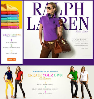
Fortunately this has begun to change, and when Drive Production’s giant horses came crashing through the walls of a German department store to help promote the new ‘Design Your Own’ collection from Ralph Lauren, the fashion brand’s mastery of digital became apparent.

When Ralph Lauren celebrated its '10 Years of Digital' anniversary with an extravagant 4D projection in New York and London in December, it was more a media event than a campaign. But when Ralph Lauren launched its 'Design Your Own' collection at Berlin's prestigious KaDeWe department store, the 8-minute film was re-configured for the indoor location.

'Design Your Own' is a new customisable range of polo shirts. Customers select their colour of shirt, and can then choose their favourite Ralph Lauren monogram, in whatever colour they choose - creating the perfect polo just for them.
The atrium of one of Europe's largest luxury department stores, the KaDeWe in Berlin, has been taken over for the entire month of August, with a bespoke 4D digital arts installation from Drive Productions running six times a day. This is the first time 4D mapping has been used inside a fashion store anywhere in the world.
Powerful architectural projection mapping technology takes the audience on a visual journey, creating the illusion that images of models, products and on occasion polo ponies are literally appearing beyond the walls and floating out into space and towards the audience. The experience featured a new ending, to incorporate the 'Design Your Own' collection,.
At each screening, the atrium at KaDeWe - a large, brightly lit space is turned into a cinematic presentation area in a matter of minutes with the use of a combination of motorised blinds, projection screens and heavy black velvet drapes. The projection area is equivalent in size to six double decker buses.
Drive's motion graphics team created the impression of a building projection on the clean, white interior architecture at KaDeWe by projecting 3D architectural geometry, onto and into which the content of the show had been mapped.

Ben Fender, company director of Drive Productions, commented: "Architectural 4d video mapping is that rare thing - a technique that still has the wow factor - both in terms of the creative and technological possibilities it gives brands and in terms of consumer reactions to it.

But the key factor to the success of this medium is the transformational content where It is now possible to create art installations that act as stand-alone pieces of global advertising- bringing together art technology and in this case 'design your own' fashion into one perfect package."


Ralph Lauren 4D Projection Mapping Show, Berlin


The Official Ralph Lauren 4D Experience - New York


The Official Ralph Lauren 4D Experience - London


BRAND:Ralph Lauren
BRAND OWNER: Ralph Lauren
REGION: Germany
DATE: August - August 2011
AGENCY:Drive

Jack & Jones Fitness Club

Using sex to sell isn't innovative, but the clever addition of a VIP club to persuade even casual viewers to submit personal information takes advantage of the viral potential of the site.

A campaign that uses overtly sexual imagery to drive consumer engagement. It isn't big, and it isn't clever, but this online fitness studio that promotes the spring/summer collection from men's fashion brand Jack & Jones provides hours of entertainment.
Jack & Jones is a brand for the fashion-conscious man about town. Positioned toward the premium end of the crowded high street category, it's important for a brand like J&J to keep men interested. Unsurprising then, that J&J decided the best course of action was to treat the boys to a pretty lady who would cavort about on their computer screens.
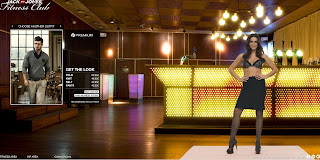
Visitors to the Jack & Jones Fitness studio first of all choose their look from the collections on offer. Based on the premise of teach the user some exercises that will help get them in the best shape to show off their new outfit, a helpful gym instructor shows the lucky online shopper some helpful moves. In her pants.
The premise is simple, slightly ridiculous but excellently realised digitally.
Visitors who want to see more can visit the VIP club, with the promise of more gym class demonstrations. A pass to the VIP club can be obtained by purchasing product or submitting some personal details to a mailing list.
Once in the VIP section, the Jack & Jones instructor offers classes in skipping, pole dancing and trampolining.  As an extra treat, the viewer can switch on options, such as slow-motion or water, to add to the experience.
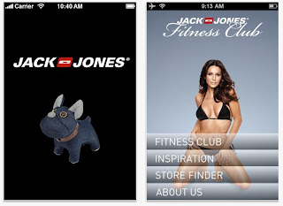
An associated Jack & Jones Fitness Studio iPhone app replicates the experience for mobile, helping users to "get in shape and ready for action".


BRAND:Jack & Jones
BRAND OWNER:Bestseller A/S
CATEGORY:Accessories/Clothing/Footwear
REGION:DenmarkFinlandGermanyThe NetherlandsNorwaySwedenUnited Kingdom
DATE:June 2011 - ongoing

27.3.12

Hitler says!!!


Turkish cosmetics company Biomen has gone public with a new commercial for mens' shampoo, starring none other than Adolf Hitler.


"Beneath the images of the Nazi leader the firm typed the message 'If you are not wearing a woman’s dress, you should not use her shampoo either.'


The piece then concludes: 'Here it is, a real men’s shampoo, Biomen.'"

7 Skills for a Post-Pandemic Marketer

The impact of Covid-19 has had a significant impact across the board with the marketing and advertising industry in 2020, but there is hope...