7.8.09

Water slide virals

Microsoft

BMW

Brand(s) Shortened Name

Two name changes—or more correctly, modifications—have received attention in the media and branding worlds recently. Pizza Hut has announced that its boxes and select locations will carry the name “The Hut,” and RadioShack plans to unveil new creative for “The Shack,” its shorter, catchier moniker.

These name shortenings are proof of what professional namers already know: names acquire meaning, they don’t create meaning. Once meaning is established, the brand name can be reduced to a shorthand version of itself, signaling its secure place in the realm of consumer awareness.

In the case of Pizza Hut and RadioShack, there’s also a more tactical motivation. As brands move away from their legacy offerings and expand product assortments, they outgrow their descriptive names. Today, Pizza Hut sells more than pizza, and RadioShack has more than radios on its shelves. The two brands are larger than their original products; their names stand for tangible and intangible experiences.

There’s also a familiarity expressed in a shorter name, akin to a nickname. The shorter handles inject the brands with a first-name-basis ease that everyone can participate in, but that ultimately acknowledges a loyal clientele. “The Hut” isn’t just any hut, it’s the hut. The only hut.

Name shortenings are nothing new. For decades, brands have abbreviated their names to reflect vernacular speech or to protect

equity. In many cases, the brand adopted and claimed ownership of a nickname, a testament to the reverse influence consumers can have on brands. Here are a few notable examples.

Kentucky Fried Chicken

In 1990, the Commonwealth of Kentucky trademarked the name “Kentucky,” forcing businesses to pay a licensing fee to use it. KFC was able to sidestep the issue by changing its brand name to the commonly used nickname. The fast-food restaurant has recently expanded its brand nomenclature to include KGC (the “G” standing for “grilled”).

Jack In The Box

The brand’s new logo positions “Jack” as the primary name by demoting “In The Box” to a visually subordinate level. Whether “Jack” becomes the official name has yet to be seen.

Charles Schwab

Not a name change, but noteworthy nonetheless—the brokerage’s most recent ad campaign employs the headline “Ask Chuck,” conveying a trusted familiarity.

America Online

The company officially changed its name to AOL in 2006, stating: “Our new corporate identity better reflects our expanded mission—to make everyone's online experience better. Plus, consumers in the U.S. and around the world already know us by our initials."

American Express

Amex, the abbreviated form of the name, is a company trademark.
Federal Express: Global market research revealed that “federal” connoted something bureaucratic and slow, and the full name was difficult to pronounce in certain foreign markets. In 1994, Fedex was adopted as the official brand name. The company’s new name also proved much easier to use in visual applications where space was limited.

Coca-Cola

The company behind the legendary drink registered the name Coke in 1945, but it has since become a genericized trademark.

As for The Hut and The Shack, time will tell what market reception of the shorter names will be. In the latter’s case, there’s clearly an intent to inject a youthful hipness into the brand. Advertising invites customers to “Crash the Party” at The Shack’s dedicated web page, where an urban palette and social media define a more progressive brand experience. Is this a fresh new chapter for the dated electronics catchall? Does the literal meaning of “shack,” a crudely built structure, unwittingly reinforce the brand’s slipshod merchandising strategy? Like all brand names, new or modified, The Shack will acquire the meaning that consumers give it.

Coca-Cola vs. Pepsi

Coca-Cola Logo

In the last couple of weeks, a JPG has been making the internet rounds and, in the process, has gathered more than 6,500 Diggs (not that that is any measure of successful success, but still…) and has been mentioned in dozens of design and culture blogs, including many which I frequent and respect. The problem is that the JPG is wrong and disingenuous. It comparatively illustrates the evolution of the Pepsi and Coca-Cola logos from their beginnings in the late nineteenth century to their current state at the end of the 2000s. The comparison chart mocks the ever-changing personality of the Pepsi logo in contrast to Coca-Cola’s stoic script logo, unaffected by the effects of time. The philosophical point it makes is indeed funny and, for the most part, accurate: Coca-Cola has long been the steady brand that triumphs over Pepsi as the latter attempts to gain ground with brand gimmicks and changes. And I will be the first to admit that the Coca-Cola logo and its consistency over the years is far more supreme than Pepsi, but every time I saw this JPG come up in more and more web sites and blogs I couldn’t help but cringe at the inaccuracy and deception it engenders.

Coca-Cola vs. Pepsi Chart Fail

Pepsi vs. Coca-Cola Logo Evolution chart with a fat X from Brand New.

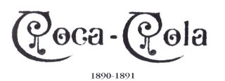
True, no one will die and the lasting effects of this JPG mean nothing, really. But I felt a burden of duty to correct a few things. The biggest problem is that the chart puts the same logo in 1885 as it does in 2008. This is not only wrong but idiotic. Technically, the Coca-Cola logo as it exists today can not be replicated with the tools of 1887 which, by the way, is the year the script logo was introduced. Not 1885. Coca-Cola was first served in 1886 and even then, the first official logo of Coca-Cola was not the script logo. It first appeared in the Atlanta Journal Constitution in 1886 as both a slab serif and chunky sans serif — it wasn’t until mid-1887 that Frank Robinson, Coca-Cola’s bookkeeper, drew the first traces of the Spencerian script logo that we all know.

Coca-Cola First Logo

First Coca-Cola logo appeared in the Atlanta Journal Constitution on Saturday May 23 1886.

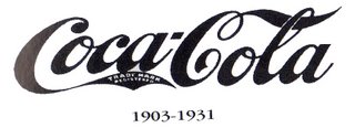
The chart, for comic and poignant effect, then leaves a 120-year gap between the first and last logos. It makes for a great viral JPG, but not for telling the real story. For the first ten to twenty years you could probably find a dozen different executions of the Coca-Cola script as the logo was probably drawn over and over for different applications. It isn’t until the 1930s and 1940s that a clear interpretation of the logo appears and is used consistently. During the late 1950s and early 1960s the script logo is placed within a shape, referred to as the “fishtail” logo, which is as off-brand as anything that Coca-Cola has ever done.

The chart also fails to mention the introduction of the wave, a ubiquitous visual today, that was first implemented in the 1960s when Lippincott Mercer was in charge of making the Coca-Cola identity more consistent. More than any Pepsi blunder, the chart ignores the introduction of “New Coke” in 1985 with a new formula marketing and set of logos — that completely ignored the script logo — that left a bad taste in their consumers’ mouths. Around the same time, in 1986, Landor began rolling out an even more developed brand identity that modified the wave among other subtle changes.

Missing from the chart in the Coca-Cola evolution is the penchant for Coca-Cola to use the shape of its bottle as an icon, acting on and off as the logo or complementary logo or subsidized logo of the main script logo, sometimes to a confusing fault. Today’s Coca-Cola logo is, of course, amazingly similar to what it was 124 years ago but it’s not quite fair to idolize them for a flawless consistency that they haven’t actually earned.

Once more, I will say that the Coca-Cola evolution is admirable and few companies — probably just GE — can claim to have extended their identity heritage across three centuries, but Coca-Cola isn’t perfect and as much as I despise the new Pepsi identity — which in no way am I trying to defend — I believe a fair comparison is in order.

So, here is the new chart. It’s not ideal, since I didn’t have a document as clean and specific as this onefor Pepsi (scroll to last page of PDF) and I had to cobble the logos from different sources. The reds are all over the place and some are in black and white.

Coca-Cola First Logo

Excerpt Empty===============
Coca Cola Script Trademark/Logo


Early script variation with diamonds.

Unusual typestyle used on a number of calenders.

Early script with the line extending from first "O" "Trademark" in tail; also no trademark in tail.

Crude script with "Trade-mark" in tail, under the tail or no trademark with "Trade Mark Registered" in tail 1901-1903

Custom script with "Trade-Mark" in tail; note open "O's", and unusual tails on "C's"

Misused script "Trade-Mark Registered" in tail; used on some 1903 calenders.

Traditional script "Trade-Mark Registered" in tail.

Traditional script "Trade-mark Reg. U.S Pat. Off." in tail

Traditional script "Reg. U.S. Pat. Off." under script.

Traditional script "Trade Mark (R)" under script.

"Arciform" logo also called "Fishtail" logo by collectors.

"Dynamic Ribbon" also called "Wave" logo; actually introduced in late 1969

AVIVA | "Life's Little Drama" commercials

Client: AVIVA
Agency: AMV BBDO, London
Production Company: Outsider
Director(s): Henry Littlechild
Creatives: Simon Chaudoir (DoP)
Diane Leaver (Creatives)
Si Rice (Creative)
Adam Rudd (Editor)
Yvonne Chalkley (Agency Producer)
Country: United Kingdom

Johnnie Walker | The Walk (The Man Who Walked Around The World)

credits

Brand: Johnnie Walker whisky
Agency: BBH London
Agency Producer: Ruben Mercadel
Creative Director: Mick Mahoney
Creative: Justin Moore
Director: Jamie Rafn
Production: HLA
Producer: Stephen Plesniak
Director of Photography: George Richmond
Post Production: Glassworks London
Editor: Kate Owen


==========================

Johnnie Walker


-

-

-
-

-

-
-

-

Slogans
1976:
Born 1820 - still going strong.
1996: Taste life. (Red Label)
2000:
Keep Walking!
-
www.johnniewalker.com

RadioShack |Rebrand

John Butler, executive creative director and founding partner of Butler, Shine, Stern & Partners, said the TV ads, in conjunction with all the various elements of the campaign, are meant to offer bits of information that in total tell RadioShack's story. "We looked at it almost like snacking. We could have a lot of little snacks throughout our broadcast and it felt like it would allow us to do a lot of different messages quickly. They are almost like interstitials," said Butler. "It's very music and design centric and products are front and center."

Tomorrow, the company will kick off a three-day event in New York's Time Square and San Francisco's Justin Herman Plaza. "The Shack Summer Netogether" will use two 11 x 17-foot "laptops" broadcasting live video to connect activities in both cities.

RadioShack plans to use digital media to connect consumers with its experiential program via a
new Web site designed by BSSP and its new Facebook page.

"The idea was to use Facebook as a platform to break into social media," said David Blum, executive director of interactive services at BSSP. "It's the predominant place where social interaction happens on the Web nowadays."


Major media spending on the brand is approximately $120 million annually, excluding online spending. Aegis' Carat, Dallas, handles media dutie

The campaign includes new in-store signage, digital media, out-of-home, direct and a three-day bi-coastal event that will broadcast live video connecting New York and San Francisco. It aims to give the 88-year-old brand, which began in the 1920s as a provider of equipment for the then-budding field of amateur radio, a more modern image that speaks to its premium brand offerings in wireless and connectivity.

The ads are decidedly quirky and range in style and tone from the introductory spot described above to a commercial that tells consumers "The Shack sells more phones than the population of Scandinavia." In the latter, an animated ad is set in "Phonelandia" and features thumping European dance music and phones and PDAs dressed in wigs and hats, drinking beer and smoking pipes and generally chillin' in a grassy field with a mountain range backdrop.


Another spot stresses that the electronics retailer has more "expertise than a truck full of Einsteins" with imagery of a lorry crammed with just that.

This 15-second commercial is one of 12 new TV ads to begin running nationally tomorrow as part of the Fort Worth, Texas-based retailer's ambitious effort from Butler, Shine, Stern & Partners in Sausalito, Calif., to rebrand itself, at least informally in its marketing materials, with the shorter, presumably friendlier nickname.

"If you think about how you use nicknames, you generally use them with friends, people for whom you have an affinity and trust. Those are important attributes for any brand and certainly for us," said Lee Applbaum, CMO of RadioShack, who explained that consumers and the company have used brand name shorthand for years. "If you can latch onto a brand truth, it's a really wonderful thing."


----------------------UPDATE-------------------------------

Radio Shack launched yesterday a new marketing initiative to position itself as The Shack. “Our friends,” they claim “call us the Shack.” With friends like that, who needs enemies?

“Trust is a critical attribute of any successful retailer, and the reality is that most people trust friends, not corporations. When a brand becomes a friend, it often gets a nickname — take FedEx or Coke, for example. Our customers, associates and even the investor community have long referred to RadioShack as ‘The Shack,’ so we decided to embrace that fact and share it with the world,” said Lee Applbaum, RadioShack’s chief marketing officer.

The Business Journal

The Shack Logo

As far as I understand, the Radio Shack name and logo will NOT be replaced with this new name or “logo.” It’s simply part of a campaign to help seed this new persona, created by Butler, Shine, Stern and Partners. Which is good news, because The Shack is extremely ridiculous — even more so than The Hut— and does nothing but dig Radio Shack into a bigger hole of un-coolness. The effort is in no way aided by the unimaginative graphics and “logo” that have accompanied the launch. The type is boringly simple, even annoying in its lackluster execution. And, seriously, giant laptops to create buzz in the two cities (New York and San Francisco) where there are more people with their head buried in an iPhone per capita than anywhere else? Oh, and yes, they are plain lame. Giant pumpkins on ice sound more appealing.

Radio Shack needs a major overhaul and it should take advantage of the idiosyncratic products they carry that you can hardly find anywhere else, a sort of geek thrift store. The Shack campaign is insipid at best and harmful to the brand at worst.

The Shack in Action

Giant laptop in the making. Image source.

The Shack in Action

The Shack in Action

Launch at Times Square in New York. Photos by Flickr user Brechtbug

6.8.09

Axe| Periodic table


Advertising Agency: Lowe/SSP3-Bogotá, Colombia
Executive Creative Director: Jose Miguel Sokoloff
Creative Directors: Margarita Olivar, Juan Carlos González
Art Director: Margarita Olivar
Copywriter: Juan Carlos González
Photographer: Esteban Sosnitsky, Zumo
Agency Producer: Sonia Llanos
Other Additional Credits: Juanita Delgado, Natalia Franco

Evian babies are not Original

Evian Roller Babies


Running Bear (JOHNNY PRESTON) Dancing Baby


Absolut| "Doing things differently leads to something exceptional"

TITLE:Anthem
BRAND:Absolut
AGENCY:TBWA\CHIAT\DAY NEW YORK

Catherine Zeta-Jones:::Horndogs in T-Mobile ads

New strategy by the carrier of showing horny guys drooling all over the actress...


T-Mobile Mobile Makeover "Invisible"


T-Mobile Mobile Makeover "Dinner"


Google These Billboards

When the online search provider Google wanted to push its Enterprise software to business leaders, the company chose outdoor advertising.

By buying billboards along well traveled routes in four cities (the Massachusetts Turnpike in Boston, MA; the Eisenhower Expressway in Chicago, IL; the West Side Highway in New York City, NY; and U.S. 101 in San Francisco, CA), Google is making sure it reaches as many people in its target audience as possible.

As reported in
Mediaweek, the campaign focuses on the internal monologue of a business professional who is frustrated with other, more expensive software offerings. Over the course of a month, commuters will see the fictitious businessperson come to an epiphany and switch to Enterprise.

The campaign is accomplished through daily vinyl copy changes. Workers change the copy between 6:30 and 7:30 am, guaranteeing the next installment is ready for that day’s commute.
It’s not the first time Google has gone outdoor. The company has used bus ads and poster size billboards in the past to raise awareness of new offerings. This is, however, most likely the highest impact campaign from the search giant yet.

The campaign generated massive media attention, with coverage in major newspapers (such as the Boston Globe) and in the trade press (in publications such as PC World).

It serves as an excellent example of outdoor advertising being the premiere way to reach busy commuters, and make a splash doing it.

One has often heard this in client conference rooms: ‘why can’t we build a brand without any advertising? Like Google?’. One can, if everyone had a Google-like product. Thanks to a heady mix of great product and PR, Google rarely had to use advertising to promote it’s search engine. With Microsoft offering some serious competition via Bing, Google has perhaps seen the need to get back at Microsoft. Google is now taking billboards across several US cities to promote Google Apps – a bundle of business applications that sells for $50 per worker annually, in a campaign labeled ‘Going Google’.

Googlebillboard Going advertising: Google billboard   sign of things to come?

The cloud-based, free Google Apps have been around since 2007 but have not been a serious threat to Microsoft’s Office suite. Even though the paid version is ‘a fraction of what Microsoft Exchange costs’ it still hasn’t been able to break the big business’ preference for MS Office. With new ventures like Chrome OS, Google may have to rely on a lot more than word of mouth to promote it’s applications. The advantage it has is that Google being Google, it gets written about for anything it does. Even if it is a pretty average billboard put up in Boston.

Do yo think Google needs advertising to sell it’s wares?


7 Skills for a Post-Pandemic Marketer

The impact of Covid-19 has had a significant impact across the board with the marketing and advertising industry in 2020, but there is hope...