31.7.09

23 print ads with great illustration styles

Maybe it’s my penchant for drawing from my childhood days, that I still seek out great illustrations and drawings in ads. Vintage ads had to perforce resort to illustrations to convey their message – ads for Pears, Lifebuoy and several others come to mind. Photography then became the norm. Illustrations then became a way of breaking the clutter, as they simply looked different.

Herewith a small collection of ads which use illustrations to enhance the advertising concept. .

1. Huggies Diaper

huggiesmature2 23 print ads with great illustration styles

Advertising Agency: Ogilvy, Beijing, China

Diaper pants for the more mature toddler, says the ad. I guess it would have been difficult to capture the situation through photography. One other ad in the series is here.

2. Ariel

You need to stare at what’s going on in the lipstick smear to figure out the message. A stain can reveal a lot is the intended claim.

Ariel Lipstick.jpg
Advertising Agency: Saatchi & Saatchi Mumbai, India
3. BETA: Adopt a dog

Well, adopt a dog because they will at least not resort to stuff your kids resort to, is a bit much. But the illustration style is great.

Beta Playboy.jpg

4. BROS Mosquito Repellent

Cartoon or illustration? Whichever. I thought both the concept and the execution were simply superb.

Bros husband.jpg
Advertising Agency: Leo Burnett Warsaw, Poland
5. Coaching-canin: Dog Training School

Imagine attempting to photograph a dog controlling its urge to jump at the barbecue stand by ‘pulling’ its own leash. I guess some concepts are best captured through illustrations.

Coaching Canine - Barbecue.jpg

Advertising Agency: CBGrey, Paris, France

6. Friskies Nido Bird Food

Winner of several awards, this surely appeals to the pet owners among us. Owners are said to resemble their pet dogs (or is it the other way around?) over time. Birds, too?

colonel 23 print ads with great illustration styles

Advertising Agency: DDB, Madrid, Spain

7. Comedy Central

Laugh out loud stuff. And from Germany, to boot.

Comedy Central.jpg
8. Bacaolinita: Healthier kids

Hmm, healthier kids is the proposition. The stretch is that while the kids are healthy, can’t say the same about their parents. Nice twist.

daddysick 23 print ads with great illustration styles

Advertising Agency: Lowe Honduras

9. Durex: Stork

Thanks to Durex, the stork has found an alternate profession.

durexmail 23 print ads with great illustration styles
Advertising Agency: DDB New Zealand

10. Faber-Castell

A simple, memorable twist on how ideas take shape. Or not take shape.

faber2 23 print ads with great illustration styles
Agency: Full Jazz, São Paulo, Brazil. Rest of the ads in the series are here.

11. Tiji TV

As imaginative as children, is the claim.

Tiji 23 print ads with great illustration styles

Rest of the ads are here.
Advertising Agency: DDB, Paris, France

12. Heineken

Call it 3D-Art and not strictly illustration, but the end result is still ‘wow’.

heinekenmanhattan 23 print ads with great illustration styles

13. Terra Web: Parental Control

The web can be a dangerous place for kids. Setting up a pretty picture only for you to discover the shocker in it, is a nice approach.

Terra -lake.jpg

Advertising Agency: DDB BRASIL, Sao Paulo

14. Levis Slim

The campaign that won a lot of accolades for JWT, India.

Levis Slim.jpg

15. Levis Kids

As I said before, nice leap from ‘tough jeans for kids’.

levisHUMPTY 23 print ads with great illustration styles

16. Macacolandia Design Studios

Perhaps the best example of how an illustration can bring an idea alive, ‘give more life to your illustrations’ is the claim.

Macacolandia Design Studios.jpg
Agency: Fischer America Comunicacao Total, Brazil. Rest of the ads in the campaign are here. The campaign also inspired (cough, cough) this set of ads for Animaster.

17. Smoking Kills

One of the many ads attempting to either scare a smoker out of his habit, or entered into awards, whichever comes first.

peoplecigarette 23 print ads with great illustration styles

18. Rotomac

Lasts forever is the claim for this brand of pens. Any idea how the pen ‘lasts forever’?

RotomacTheresa 23 print ads with great illustration styles

19. Schwarzkopf Anti-Dandruff Shampoo

Don’t leave a trail behind is the claim.

Schwarzkopf Dandruff.jpg

20. Sharpie

This is a take off on a famous Burger King ad. So it’s like an inside joke for the agency folks.

Sharpie 23 print ads with great illustration styles

21. Tide – angels

Where has the dirt gone? To the heavens, with a little help from angels.

Tideangels1 23 print ads with great illustration styles
Rest of the ads are here. Advertising Agency: Conill Saatchi & Saatchi, Miami & NY, USA

22. Showoff Films

Sure to appeal to the much-beleaguered advertising agency folks.

showoff wolf 23 print ads with great illustration styles

23. Coca Cola

Finally, a blast from the past. The whole Santa series of print ads and TV commercials from Coca Cola usually score high on the feel-good factor.

Coca Cola.jpg
Source: Flickr

Of course, there are several other examples, like the Clinic All Clear ads and Sour Marblesads from India. Speaking of regions, notice that a lot of the ads listed above are from Latin American countries? Hope you liked this collection. Do comment on the use of illustrations above and point us towards more such inspiring stuff.

Lego:::Making History.

Brandenburg Gate
Ali
Tank


Advertising Agency: Jung von Matt/ Alster Gmbh, Hamburg, Germany

Chief Creative Officers: Armin Jochum, Deneke Von Weltzien

Creative Directors: Fabian Frese, Gotz Ulmer, Daniel Frericks
Senior Art Director: Andre Price

Senior Copywriter: Sergio Penzo

Producer: Claudia Schildt/Fabian
Designers: Florian Zwinge, Tilman Gossner
Photographer: Claudia Schildt/Fabian

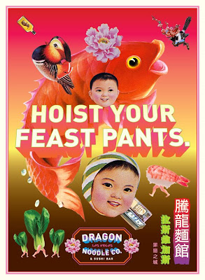
Dragon Noodle Co

Satisfaction palace
Magic tingles


Feast pants


Advertising Agency: David&Goliath, Los Angeles, USA
Executive Creative Director: Colin Jeffery
Chief Creative Officer: David Angelo
Creative Director / Art Director: John Kieselhorst
Copywriter: Greg Szmurlo

Absolut Vodka: No label

absolut1
“For the first time we dare to face the world completely naked. We launch a bottle with no label and no logo, to manifest the idea, that no matter what’s on the outside, it’s the inside that really matters. 
The bottle visually manifests our belief in diversity and our standpoint when it comes to sexual identities. Off course it is also a wonderful piece of delicate and minimalist design, a true collectors item” says Kristina Hagbard, Global PR Manager at The Absolut Company.
ABSOLUT was one of the first commercial brands to openly embrace the LGBT (Lesbian, Gay, Bisexual, Transgender) community and its ads have appeared in gay media since 1981. With this initiative, ABSOLUT is again showing its support for the LGBT community.
“There are too many clichés associated with the LGBT community. LGBT people are often referred to as one homogenous group but when you think about it: does a 60-year old lesbian woman from South Korea necessarily have that much in common with a 20-year old gay man from Berlin, or a Brazilian transgender person of indeterminable age?” Kristina Hagbard continues. “By challenging labels and prejudice we want to explore problems around this subject, and at the same time promote a more diverse, vibrant and respectful world.
The limited edition bottle will be launched globally in October 2009. It is the original ABSOLUT bottle, designed by Swedish designers Gunnar Broman and Hans Brindfors in 1979, but without the ABSOLUT logo and label. A discrete and easily removed sticker with the campaign manifesto encourages consumers to discard their labels and to visit absolut.com/nolabel – a blog discussing labels and prejudice associated with the LGBT community. ABSOLUT is also introducing a No Label fan page on Facebook, together with a Facebook app, which users can activate to show their support of a world without prejudice.”
absolut2


Advertising Agency: Family Business, Stockholm, Sweden
Creative Director: John Lagerqvist
Designers: Mangus Lundgren, John Lagerqvist
Art Directors: Miki Grujovic, Christian Styffe, Fredrik Lindquist
Copywriter: Tove Norström
Photographer: Christoffer Edling
Released: June 2009


Did Ogilvy and American Express get inspired by Grasshoppers inspirational video?

This weeks mysterious coincidence is brought to you by David Hauser of Grasshopper and his googleanalytics. Did Ogilvy and American express get inspired by “Entrepreneurs Can Change the World” (which would be kind of approriate since it's meant to be an inspiration video, funny)

Is this a case of overly inspired, demo-love, or are these footprints in the digital world there for a much simpler reason -such as; Ogilvy heard from other people that their ad was similar to grasshoppers and wanted to check it out for themselves? What do you think?

Between May 1 2009 and July 26th 2009:
o Ogilvy agencies visited our Grasshopper website over 15 times, spending nearly 3 hours or total viewing time.
o The same Ogilvy agency spent the vast majority of these hours on our “idea” page which contains ONLY our video
o The entirety of their traffic was either around May 4th (when our campaign first launched) or the 2nd week in July (right before their campaign launched).
o The same Ogilvy agency then researched the producer of our video (Sonja Jacob) and visited her site 10+ times, around the exact 2 time period listed above. All the pages they viewed were specific to Sonja’s Grasshopper work

Lets watch the American Express - Small Business Owners Anthem shall we? Pay extra attention to the music.

Now, this is the grasshopper video, a two minute long kinetic type animation set to an original score created by Carly Comando.


The people at grasshopper can't be sure that this is a case of demo-love, and they add it's not the similarities that bother them, it's the lack of creativity at a BDA (to borrow George Parker's phrase).

Now what bothered us here at Grasshopper is not how oddly similar the 2 ads are, but rather the use our message. Ogilvy’s use of this “borrowed” message was for direct commercial gain by AMEX to promote their OPEN Forum. We understand that here at Grasshopper we do ultimately sell a product; but the purpose of this video was to motivate entrepreneurs, or anyone for that matter, to go out and do something, make a difference. We can’t understand why a near billion dollar agency, with so many resources couldn’t be more creative? Either way, draw your own conclusions; I simply hope you will consider spreading the word about the video that inspired it all, “Entrepreneurs Can Change the World”, as well as the message that we really are capable of turning this country around.

Newspaper vs Mailbox

Australian research into the relevance and effectiveness of newspaper inserts when compared to mailbox drops.

Key findings:

  • Advertising inserts are the most likely media to influence a consumer’s buying decision
  • They are the most popular form of media that shoppers turn to when looking to help with their purchase decisions
  • Almost 10 million, or 56% of Australians, agree that they read the ads in newspapers
    and magazines.
  • The consumer relationship with newspaper inserts is more emotive:
    - An extension of my newspaper
    - Keeping me in touch with quality brands, not just bargains
    - More lifestyle oriented than ‘shopper’ oriented

Newspaper inserts versus Mailbox drops

Noodle House


noodlehouse riyadh, saudiThe noodle house is the flagship restaurant of Jumeirah Restaurants LLC. Launched in 2002, the brand has gone from strength to strength with 10 restaurants in the U.A.E., Oman and Qatar and expanding globally with agreements already signed with franchise partners across the Middle East, Europe, and Asia. As well as the noodle house, Jumeirah Restaurants LLC also owns a number of other restaurants, including Sana Bonta, Bytes, AllFreshCo, Rice & Spice, and The Flaming Revolution with the aim to sign a total of 150 restaurants by 2012.

With long lines, dark wood, natural finishes and clean contours, the look of the noodle house is 100% contemporary. The woods used are mahogany, birch, hiroko and teak. Cool cream leather adorns the comfortable banquettes. Crockery is plain white, refreshingly simple, generously sized. Each place is set with a large cotton napkin. Places are also set with a choice of eastern and western cutlery. But while textural, natural materials like wood and leather abound in the dining area, the kitchen – which is fully open to view – features nothing but brilliant stainless steel.

People are drawn to the vibrant atmosphere of the noodle house. It is a restaurant where chefs whip up aromatic dishes within minutes over an open flame, in full view of guests. Seated at long communal tables amidst the hustle and bustle, talking to complete strangers is not uncommon. The experience is a unique combination of wholesome food and an energetic ambience that very few restaurants have been able to perfect quite like we have.

The restaurant is located on the third floor of Centria center, on the corner of Olaya and Tahliya St.

DEVK: Set theory

devk12320

devk12319

devk12318

At first glance, our diagrams look quite straightforward. But when people look closer, these graphs tell funny and interesting real-life stories. Stories that show your target group why it’s always better to be insured by the DEVK.

Advertising Agency: Grabarz & Partner, Hamburg, Germany

Stolen tyres or stolen idea?

stolen1999FCB

stolen2009

THE ORIGINAL?
Dunlop Tyres –
1999
Source : Cannes Archive Online, VIA
Blog Anubis
Agency : FCB (South Africa)

LESS ORIGINAL :
Dunlop Tyres –
2009
Source :
Dubaï Lynx Shortlist
Agency : Impact BBDO Dubaï (UAE)

7 Skills for a Post-Pandemic Marketer

The impact of Covid-19 has had a significant impact across the board with the marketing and advertising industry in 2020, but there is hope...