TNT Express kept the TNT name as part of the deal and TNT Post, (a Post NL company) agreed to rebrand by the end of 2014.
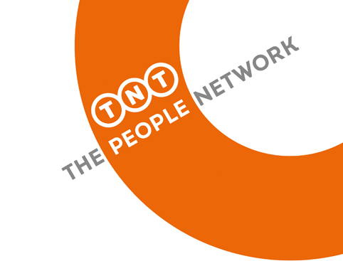
Design Bridge has rebranded delivery company TNT, positioning it as The People Network and creating a circular device which represents “perpetual motion”.
Design Bridge says it was asked to define a new strapline that would convey TNT’s new strategy and culture, and to design a new logo and brand expressions, which would “reflect TNT’s vision”.
A new strapline, “The People Network”, reflects the company’s aim to connect people and businesses in a “truly personal, rather than purely professional manner”, according to Design Bridge.
The consultancy hopes the new strapline will help “galvanise the ‘challenger’ spirit of those working internally at TNT”, as well as TNT customers.

TNT chief executive Tex Gunning, says: “Customers are not barcodes and we are not robots. We all relate to what drives our customers: business growth with a personal touch. Taking time to understand what customers really need distinguishes us from others. We are The People Network.”
The new identity is held within a cropped circle device giving the impression of being part of a journey and of “perpetual motion moving through the world” says Design Bridge.
TNT Post rebranded earlier this month in a project led by Sutcliffe Reynolds Fitzgerald.
Postal service TNT Post rebrands as Whistl

The TNT Group separated in 2011creating two separate companies, Post NL – Whistl’s (TNT Post’s) parent company – and TNT Express. The deal meant TNT Express retained the TNT brand name and TNT Post agreed to rebrand by the end of 2014.
Sutcliffe Reynolds Fitzgerald managing and creative director John Sutcliffe says the consultancy has worked with TNT for 25 years and won the work on the strength of this.
 Sutcliffe says that Whistl wanted its new brand to be “much more human, friendly and consumer facing”.
Whistl is already rolling out an expansion plan increasing its “end-to-end” delivery service, which it says means more postman on the streets making domestic deliveries as the company shifts its focus from a pure business-to-business service.
Whistl hopes to increase staff levels from 3,000 now to 20,000 by 2019.
 “That’s why Whistl needed to be softer and more approachable”, says Sutcliffe – “There are postmen walking up people’s drives.”
Senior designer Simon Grigg says that the name Whistl is musical and evokes “a posty’s whistle”. The identity is based on the Tondo typeface and the typeface for headlines is a version of Gotham Rounded, which Grigg says works well for screen and print.
Sutcliffe says that the orange brand colour is being kept from the TNT Post brand as Whistl “wanted to keep something from the past” and because “orange fits – it’s bright, warm and human”.
 Other brand and campaign elements include a 1.8m whistle built by a prop maker at Pinewood studios for Whistl ads, and the commissioning of David Morris, “the world’s top whistler”, Sutcliffe says.